01.
Seamless Airport Experience
How I eliminated terminal confusion by designing a wayfinding feature that surfaces the right information before a stressed passenger even knows to ask for it.
ROLE
UI/UX Designer (Solo)
DURATION
1-Week Sprint
PLATFORM
Mobile (Android & iOS)
TOOLS
Figma, Miro
PROJECT TYPE
Concept Project -Learning Exercise

02.
Context, problem, and how I approached it
Snapshot
This is a concept project I built during my UI/UX learning journey, based on a real and widely reported airport pain point. All research, decisions and design work here are mine. If this were built for real, I'd aim for 80% task completion for gate finding without any help, under 45 seconds from home screen to gate direction, and a measurable drop in cognitive load compared to existing signage. Next step: moderated usability testing with 8-9 participants to check if these targets actually hold up.
my Role
I handled the full process solo: research, defining the problem, ideation, and visual design. That included synthesizing research, building personas, mapping user flows, and taking wireframes through to a high fidelity prototype in Figma.
problem
The problem isn't that people can't read signs. It's that airport signage assumes you already know where you're going. Both frequent flyers and first-time travelers get lost trying to find their gate. It's not because they're careless. Terminals are built around information people don't actually have yet. The result is missed flights, added stress, and a feeling that the airport isn't on your side.
Reflection
The biggest thing I learned wasn't about visuals, it was about what to leave out. Removing the map, the search bar, and the full itinerary view did more for reducing stress than any individual screen design choice. If I had more time, I'd want to talk to 5-6 real travelers and test paper wireframes early, instead of only validating my assumptions this late in the process.
03.
Key design Decisions
Three design decisions defined this product. Each was made deliberately, with a specific user behaviour in mind.
Decision 1 - Flight-First Home Screen
The home screen shows your upcoming flight the moment you open the app. No search bar, no map to figure out. You already gave this information at check-in, so making you find it again just wastes time you don't have.
This decision directly supports the 80%+ task completion target: by removing the need to search for flight data, the path to way finding becomes a single tap from app open minimising drop-off at the critical first step.

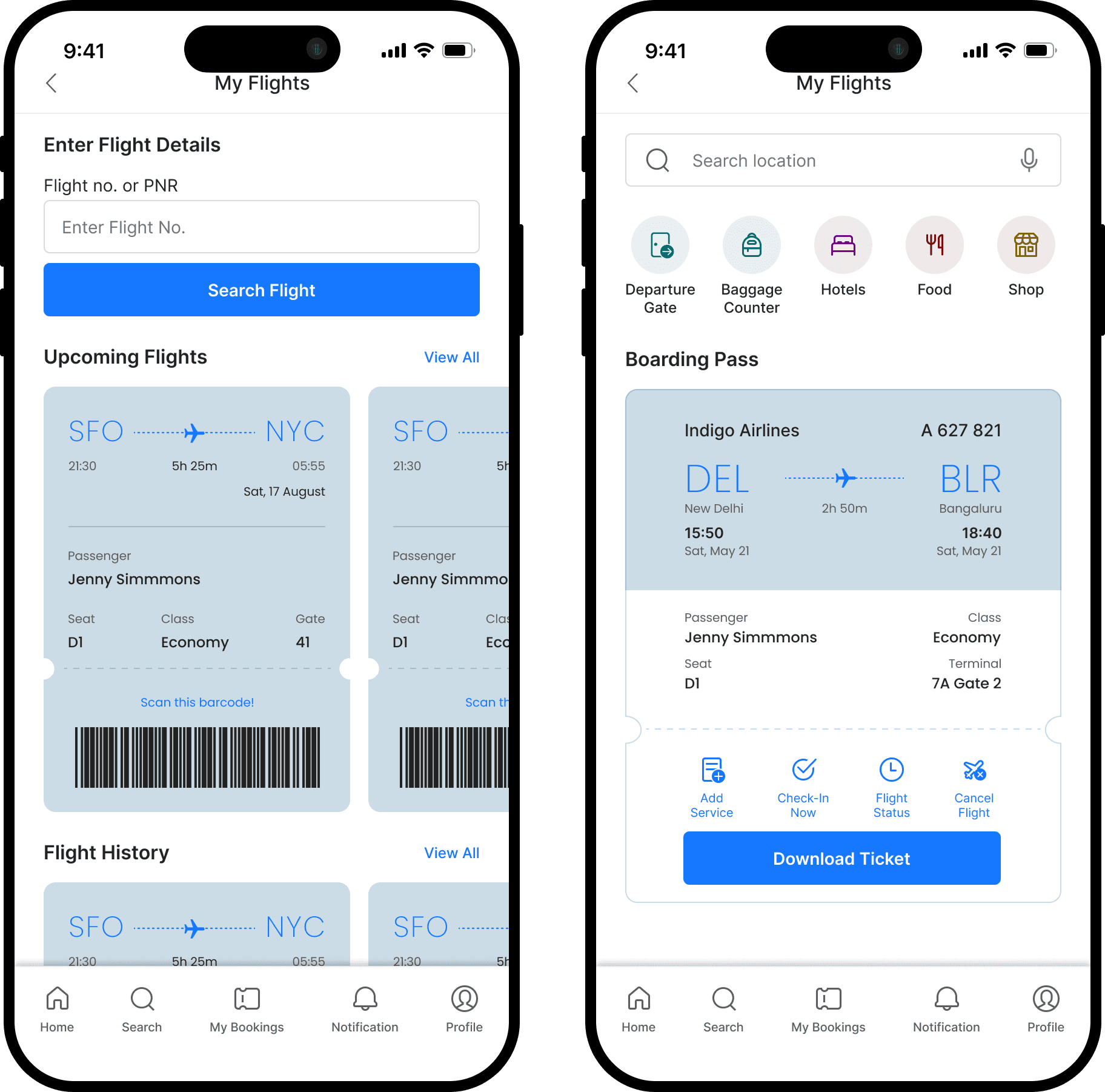
Decision 2 - Destination Buttons Over a Full Map
Instead of a full terminal map, there are simple labeled buttons like Baggage, Gate, and Food. Someone in a hurry doesn't want to study a map, they want to get somewhere. More detail only shows up once they've picked a destination.
This decision directly supports the 45-second baggage counter target: destination buttons remove the map interpretation step entirely. The user taps one button and receives a route no spatial orientation required.
Decision 3 - Step-by-Step Directions Over a Static Map
Directions appear one step at a time instead of showing the whole route at once. Someone stressed and carrying a bag can't hold a full mental map in their head either.
Step-by-step directions are designed to reduce perceived workload. By removing spatial orientation tasks, cognitive demand should stay lower even under time pressure.

04.
PROCESS
The research, thinking, and considerations behind the three decisions above. Expand any section for detail.


