02.

Brief

Context, problem, and how I approached it

Snapshot

A traffic police officer signals Rohit Sharma to pull over. He has about 30 seconds to show his RC and license before the situation turns awkward. DigiLocker holds his documents, but makes this harder than it should be: he fumbles through an MPIN, waits on an OTP that may never arrive, and sometimes finds nothing at all. This is a self-initiated concept project from my IxDF learning journey. I chose DigiLocker because it's a real, widely used government product whose usability issues affect millions of citizens. All research, synthesis, and design decisions here are my own. This project redesigns that 30-second moment so it never fails again.

Design targets

Speed: RC or DL visible in 2 taps, under 5 seconds, no MPIN or OTP wait

Offline: Quick-Show works fully without network

Setup: First-time setup under 60 seconds, zero repeat effort

Trust: Preserve DigiLocker's existing security model while adding speed

problem

"Mujhe bas RC chahiye, ye line complex kyu bana diya?" (If I just need my RC, why did they make this so complicated?)

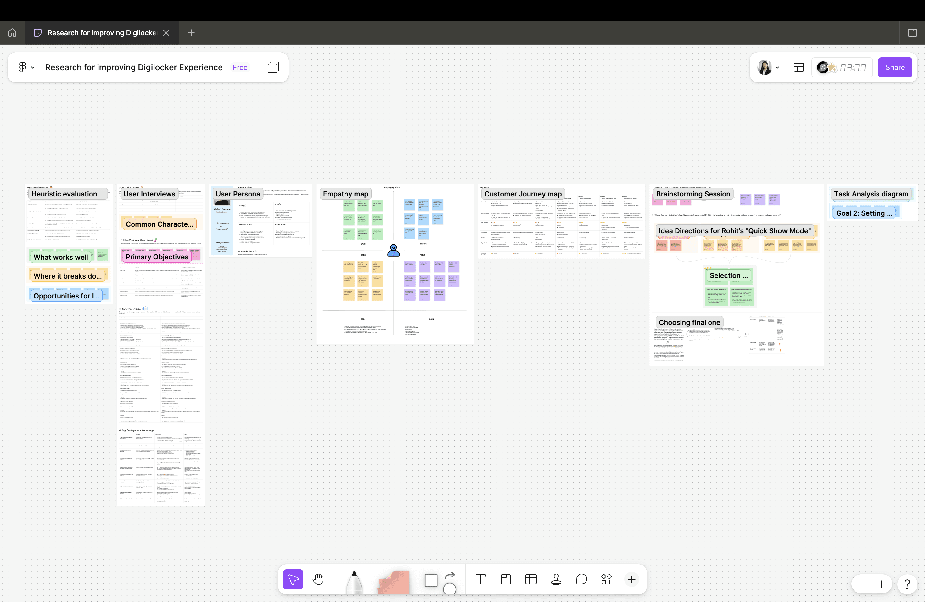
DigiLocker gives over 150 million citizens legally valid digital documents, but it was built for calm, planned moments, not a 30-second panic at a checkpoint. A heuristic evaluation of the existing app surfaced the core failures: auto-logout forces a full MPIN and OTP every session, documents are grouped by ministry name instead of how people actually think of them, there's no offline support in exactly the low-connectivity areas where road checks happen, search only recognizes formal terms, and no emergency mode exists, every session gets the same full login regardless of urgency.

My Role

I led this project end-to-end as a solo designer during my IxDF course: heuristic evaluation, research synthesis, persona and journey mapping, problem framing, ideation, task analysis, and wireframing through to high-fidelity design in Figma.

03.

Key design Decisions

Four design decisions defined this product. Each was made deliberately, with a specific user behaviour in mind.
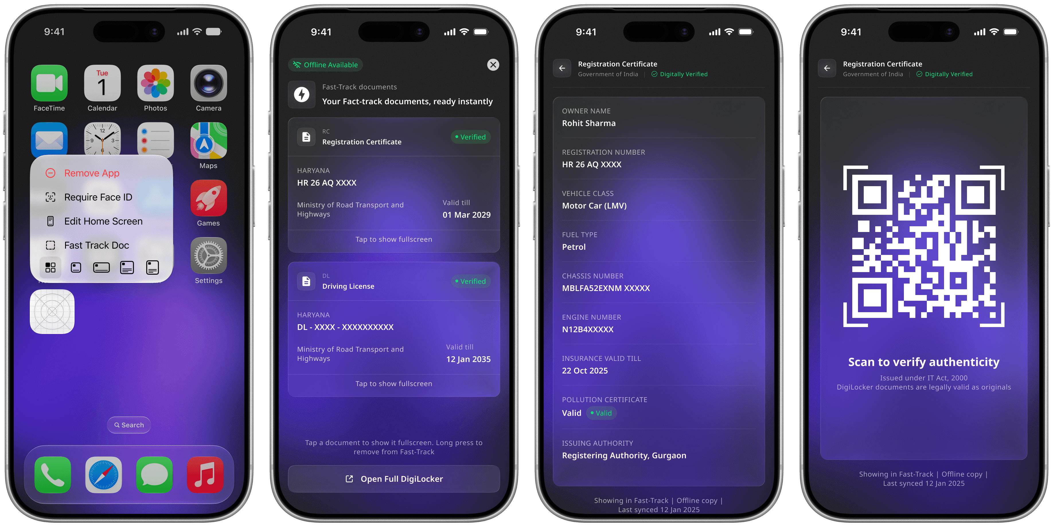
Decision 1 — Fast-Track Mode bypasses full login

MPIN and OTP were the biggest source of failure under pressure. Fast-Track replaces them with on-device biometric verification for pre-pinned documents only, the same way a fingerprint unlocks the lock screen. It works fully offline, and the rest of the app stays behind the standard login.

The safe way to unlock fast is behind the standard login, not instead of it.

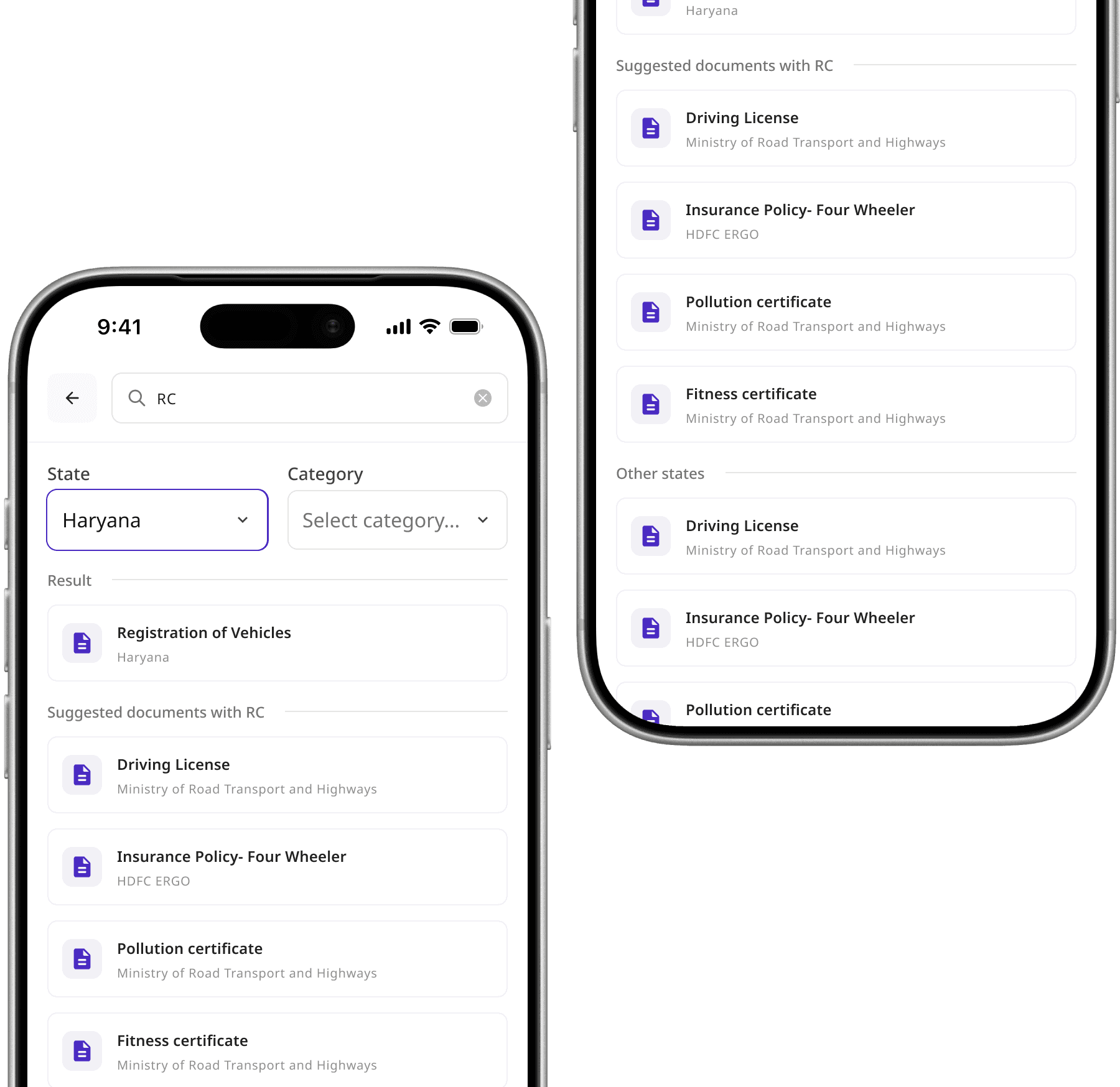
Decision 3 - Search Uses Natural Language, Not Ministry Names

The current app groups documents by issuing ministry, so the RC sits under 'Ministry of Road Transport and Highways' — nobody searches that way. The redesign matches everyday terms like 'RC' and 'car papers' to the right document, and renames categories to how users actually think, 'Car Documents' instead of the ministry name.

Information architecture should match how users talk, not how the org chart is structured.

Decision 2 — Documents cache offline at pin time

Documents are downloaded and encrypted locally the moment they're pinned, while the connection is good. Every later access reads from that local copy, so a weak signal at a checkpoint never blocks access. Only the first-time pin needs internet, every access after that doesn't.

Only pinned documents work offline. The rest of the app can stay online-dependent, because it's not the part that has to work in a panic.

Decision 4 - Document View is Built for a Third Party

The Fast-Track document view isn't built for the owner browsing files, it's built for the officer reading the screen from arm's length: large text, high contrast, the document and QR code front and center, no app chrome. A different goal from the rest of the app, so it needed its own screen.

The person reading this screen usually isn't the person holding the phone.

Decision 1 — Fast-Track Mode bypasses full login

MPIN and OTP were the biggest source of failure under pressure. Fast-Track replaces them with on-device biometric verification for pre-pinned documents only, the same way a fingerprint unlocks the lock screen. It works fully offline, and the rest of the app stays behind the standard login.

The safe way to unlock fast is behind the standard login, not instead of it.

Decision 2 — Documents cache offline at pin time

Documents are downloaded and encrypted locally the moment they're pinned, while the connection is good. Every later access reads from that local copy, so a weak signal at a checkpoint never blocks access. Only the first-time pin needs internet, every access after that doesn't.

Only pinned documents work offline. The rest of the app can stay online-dependent, because it's not the part that has to work in a panic.

Decision 3 - Search Uses Natural Language, Not Ministry Names

The current app groups documents by issuing ministry, so the RC sits under 'Ministry of Road Transport and Highways' — nobody searches that way. The redesign matches everyday terms like 'RC' and 'car papers' to the right document, and renames categories to how users actually think, 'Car Documents' instead of the ministry name.

Information architecture should match how users talk, not how the org chart is structured.

Decision 4 - Document View is Built for a Third Party

The Fast-Track document view isn't built for the owner browsing files, it's built for the officer reading the screen from arm's length: large text, high contrast, the document and QR code front and center, no app chrome. A different goal from the rest of the app, so it needed its own screen.

The person reading this screen usually isn't the person holding the phone.

04.

conclusion

DigiLocker could replace the physical wallet for over a billion citizens, but only if it holds up in the one moment that actually matters: when someone in authority asks to see it. This redesign focused on that single panic scenario. Rohit should never have to fumble for his RC, get stuck behind an OTP wait, or lose it inside a search bar. Quick-Show, natural-language search, and a third-party-optimized view all address the same discomfort: trust in a tool is built by how it performs in an emergency, not how it looks on a calm day.

05.

PROCESS

The research, thinking, and considerations behind the 4 decisions above. Expand any section for detail.

  • 01.

    Research

  • 02.

    How I got to this solution

  • 03.

    Usability testing

  • 04.

    What I'd do differently & learned

Note: Switch to a desktop screen to expand these sections and read the full research details.

Create a free website with Framer, the website builder loved by startups, designers and agencies.